This article was originally published in our Tangent 8 magazine.
Colour shapes how we feel about the places in which we live.
Almost everyone has an opinion on colour; favourite colours, most disliked colours, and preferred colour combinations. Nonetheless, these views and perceptions change with age and mood and fashion.
Colour is an emotive subject of personal expression and taste, and - as such - is a great topic for public discourse and critique; in clothes, cars, hair colour - and architecture; interior and exterior.
But the value and power of colour can be too easily overlooked and misunderstood, especially in architecture, where basic principles, nuances, subtleties, and creativity all matter.
Some principles
In terms of basic principles, for example, the colour of both the direct light source and the reflected light, shining upon a surface, greatly influence the perceived colour you ‘see’. So, whether the light comes from the sun, from an incandescent lamp, a fluorescent light, or a modern LED, each colours differently the light that comes into your eye.
Similarly, the reflected light from outside ‘bouncing’ off a windowful of green foliage, a bright yellow Animates shop, or a coloured ceiling, also greatly changes your impression of the colour you sense.
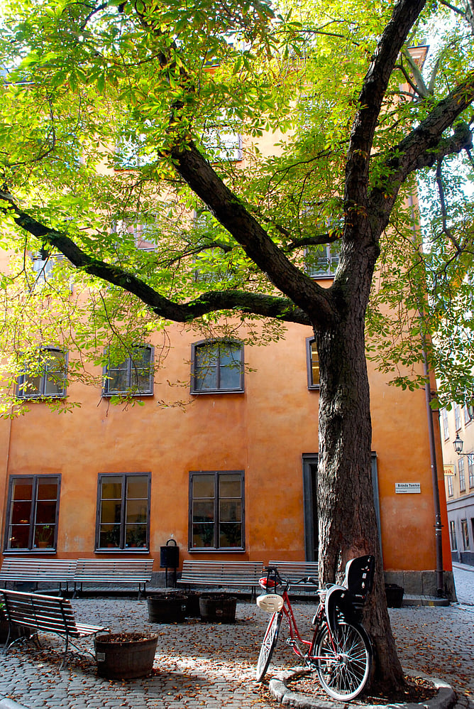
Photographed by Grant Sheehan
Another ‘basic principle’ is that colour ‘warms’ colder spaces (for example, south-facing rooms) through the use of orange and yellow hues, and cools down warmer spaces (north-facing rooms) by applying hues and shades of blue.
Cooler colours (blues, greens, and dark greys) recede when against warmer and lighter colours, while warm colours (oranges, yellows, and reds) and lighter colours advance towards the viewer. To put this into a landscape context, a lighter coloured roof would seem larger and more obvious than a darker coloured roof, which would – in comparison - appear smaller and diminish into the background.
This is somewhat of a double-edged sword, given that a darker roof absorbs and draws solar heat into a building, while a light-coloured roof reflects the sun’s rays and heat, and therefore the house stays cooler!
Nicknamed ’Toilet Towers’ owing to its aquamarine green tile cladding, nonetheless was much talked about - in contrast to the many grey buildings that somehow remain quietly anonymous.
Colour in the Landscape
The use of colour on the exterior of buildings has been increasingly regulated since the 1980s in New Zealand, particularly through the Resource Management Act; initially in the landscape context, and subsequently, in historic and town centre precincts. Tim Heath’s 1978 thesis “Colours for Structures in the New Zealand landscape” - focussing on hue and reflectance values - became a seminal document within the design regulations of many local authorities around New Zealand. Like so much about colour however, the selected palette was greatly influenced by the prevailing fashions and thinking of that time.
Luckily, in the New Zealand landscape we already have the archetypal rural red barns and milking sheds stemming from the pioneering farmers, whalers, and miners. The historic red came from the kiln-baked iron ore - a great protector for both steel and timber in the New Zealand outdoors - giving durability and longevity. It has become a theme – especially in combination with corrugated iron – of New Zealand’s rural landscape.
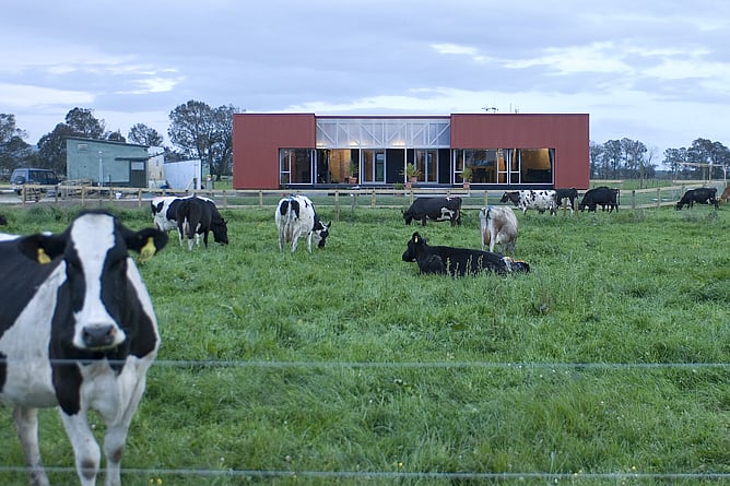
PAUA Architects made use of this theme for a farm manager’s cottage on a Cambridge dairy farm, so the house sits contextually and easily within the farm setting - and strikingly against the chlorophyll green of the pasture.
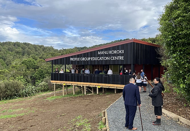
The iconic nature of the red barn is naturally matched by the red ochre and charcoal black oil-mixed preservatives that protected whakairo - the carvings of the whare Māori. Hence the colouring of Sanctuary Mountain’s ‘Manu Korokii’ Profile Group Education Centre, on Maungatautari.
In the late 1970’s - and perhaps influenced by the Seven Sisters / Painted Ladies houses of San Francisco - in Wellington’s Tinakori Road, the architectural details of an early villa were picked-out in a bold primary colour paint scheme, made famous by photographer Grant Sheehan in his iconic poster. The art of this, is that by highlighting the details, the builder’s craftwork became accentuated and appreciated.
Locally, Gordon and Barbara Campbell took a similar step in the 1980s with the re-imagining of the deconsecrated Presbyterian Trinity Church in Cambridge from a dusty grey-green paint scheme to a famous landmark known as the Pink Church.
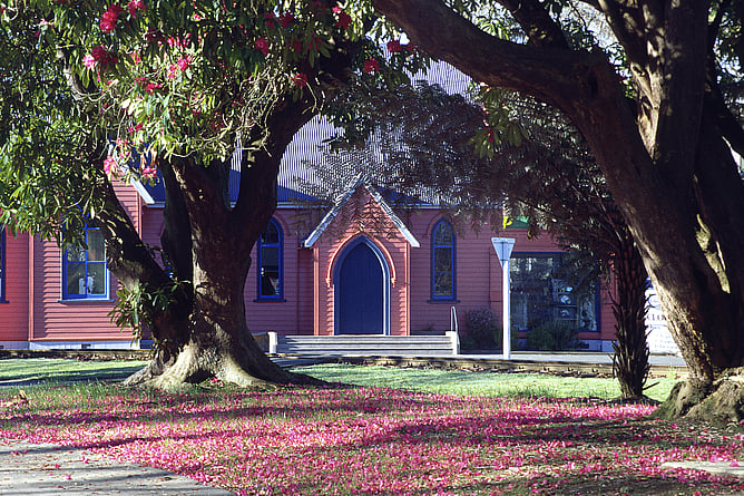
Matching the church to the bright Rhododendron pink, the colour not only highlighted the architecture in Cambridge’s leafy green streetscape, but also brought attention to the Neo-Gothic details; the arches, the finial steeples, and the faux buttressing.
In a historic context, in Stockholm on the isle of Gamla Stan, a small triangular courtyard Brända Tomten, is shaped by the walls of four-storey high apartments. If plastered in a natural sand grey, the tight court would feel cold, dark, and oppressive. However, the window-punctuated walls are paint-washed in a burnt apricot, reflecting a warmth accentuated by glimpses of sunshine straying on the cobbled lane and red-brown husks under a bright-leafed chestnut tree.
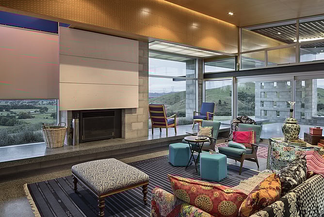
The Myers’ farmhouse in Roto-o-Rangi is an expression of the owner’s passion and appreciation for the colours of India and India’s cultural vibrancy. The bright pinks, oranges and blues reflect the colours of Indian dress and of the celebration of Holi; the Festival of Colour, Love and Spring. The bold and confident use of colour activates the house - and the heart - in a way that, for example, a white interior could not.
Confident and masterful use and application of colour in architecture takes both knowledge and courage. But, at the end of the day, sophisticated colour use can shape how we feel, engage, and are energised - or relaxed - by the environments in which we work, socialise, learn, dine, play - and live.